Nelio
Transformer une application de livraison classique en une expérience premium.
UX
UI
BtoC

Durée
Sept. 2018
— Juil. 2019
Périmètre
France
Plateforme(s)
iOS & Android, Web
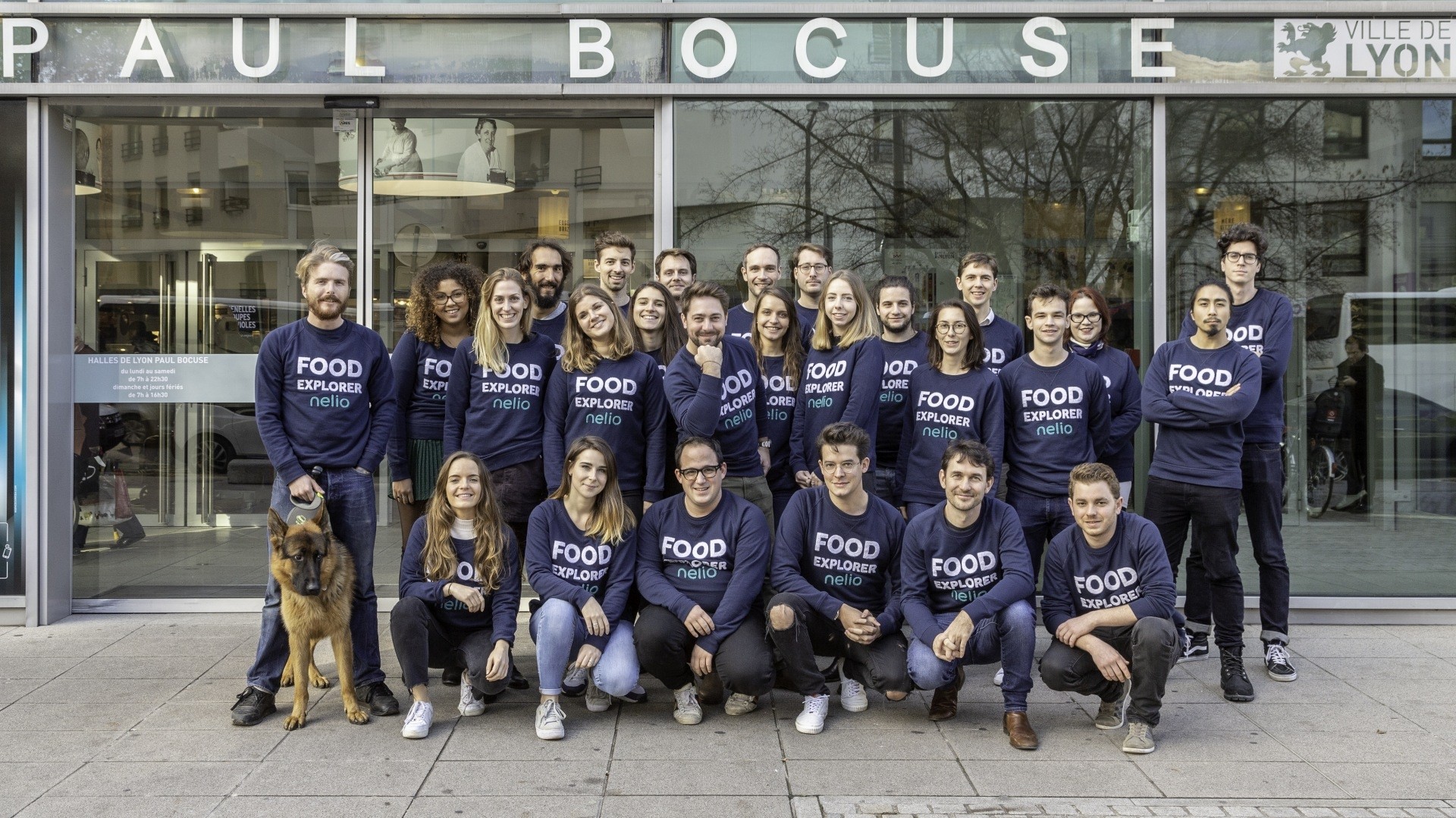
Nelio est une application de livraison de repas fondée à Lyon en 2016, proposant des mets de qualité issus d’artisans locaux sélectionnés, livrés à vélo cargo à Lyon et Paris.
Après un premier lancement, le produit avait besoin d’une direction design plus structurée en interne afin de renforcer la rétention et la différenciation de la marque.
J’ai piloté le design produit sur mobile et web, en collaboration directe avec le CEO, le CTO, les product owners, le marketing et les développeurs.
J’ai introduit des processus UX structurés et aligné les décisions design avec des objectifs mesurables de rétention.


Malgré la qualité des partenaires et des produits, l’application avait des difficultés à attirer et fidéliser la bonne cible de clients.
L’expérience ne reflétait pas pleinement le positionnement premium de la plateforme.
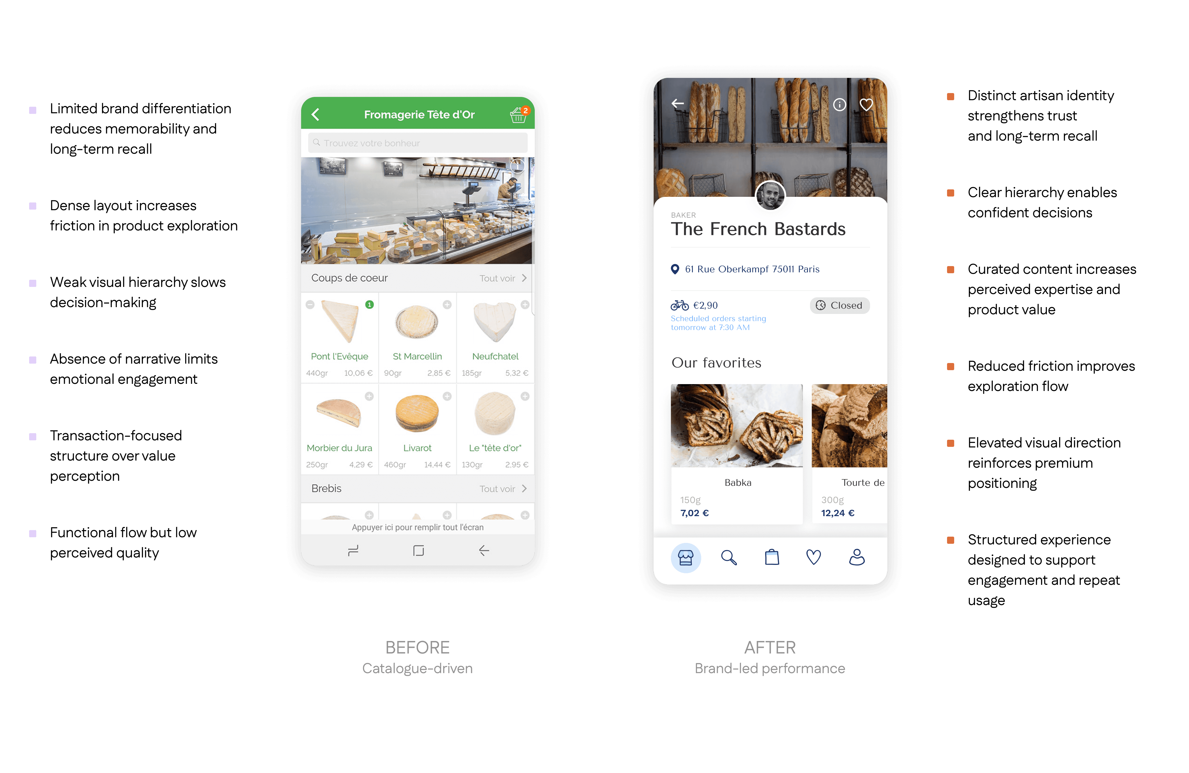
Différenciation premium insuffisante
L’interface ressemblait trop aux autres applications de livraison classiques, ce qui affaiblissait la perception de la marque.
Comment créer une expérience de livraison premium et éditorialisée
capable d’augmenter la rétention et la valeur des paniers ?
Business
Augmenter la rétention client et la valeur moyenne des paniers
Renforcer l’identité de marque
Maximiser les moments commerciaux clés
Utilisateurs
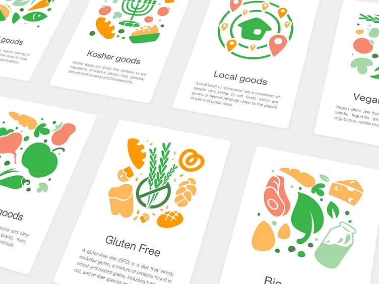
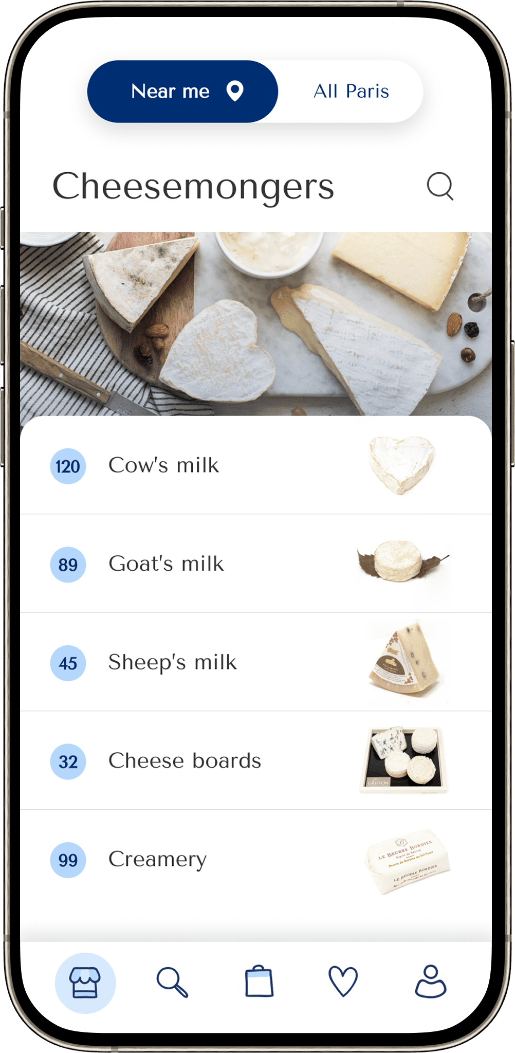
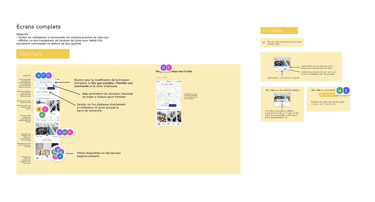
Trouver facilement des artisans sans avoir à parcourir toute la plateforme
Accéder à des informations claires sur les produits, leur disponibilité et les recommandations
Réduire la charge cognitive et rendre l’exploration fluide
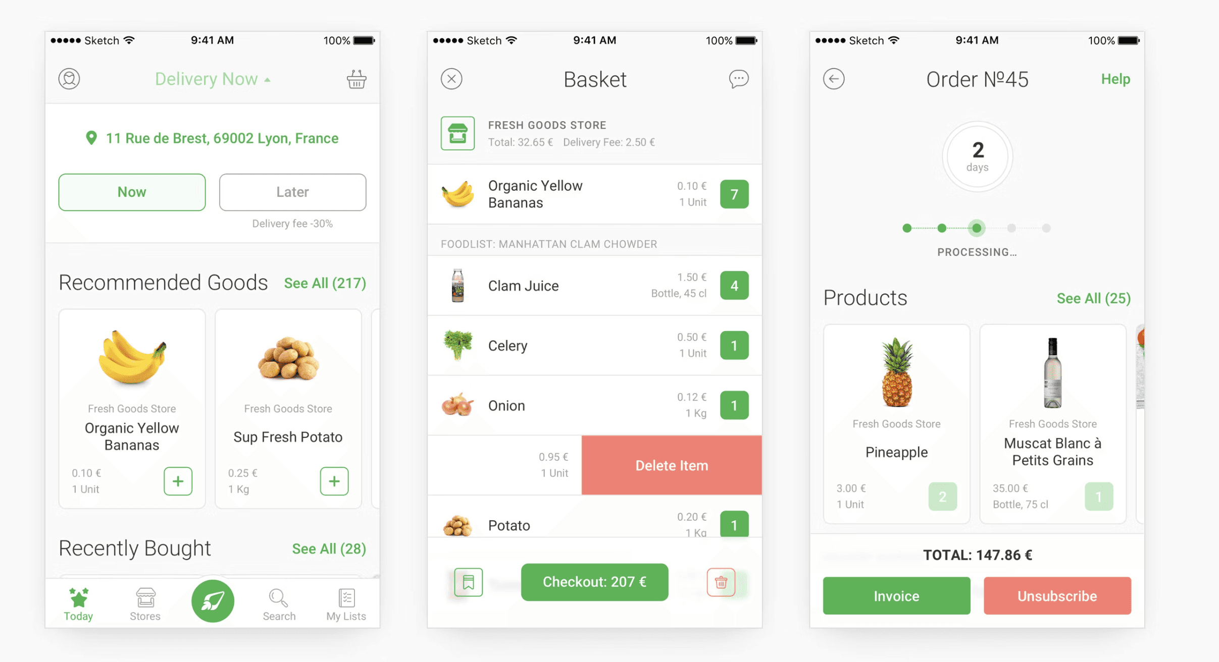
Les améliorations design ont été déployées progressivement selon les priorités business. Les versions web et mobile ont évolué en parallèle afin de garantir une expérience cohérente sur tous les supports.
Le redesign s’est concentré sur des améliorations mesurables de la rétention et de l’engagement.
d'amélioration de l’onboarding
+25%
d'augmentation de la rétention utilisateur
+18%
de taux de ré-achat
+22%
de commandes par utilisateur actif
+24%
de taux de rétention à 30 jours
+84%
d'augmentation du temps passé sur le site
Pour comprendre les besoins réels au-delà des hypothèses, nous avons mené des interviews utilisateurs avec des clients réguliers ainsi qu’un guerrilla test dans les rues de Lyon.
Ce mélange de retours qualitatifs et spontanés nous a permis d’identifier des tendances, d’affiner nos hypothèses et de comprendre pourquoi un utilisateur choisirait - ou non - notre application plutôt qu’une autre.
Pourquoi les utilisateurs choisiraient-ils
notre plateforme plutôt que celle des autres ?


A/B testing
Les décisions design clés ont été validées par des tests A/B, permettant d’appuyer les choix avec des données objectives. Cette approche a facilité l’adhésion des parties prenantes et renforcé la confiance dans la direction produit.
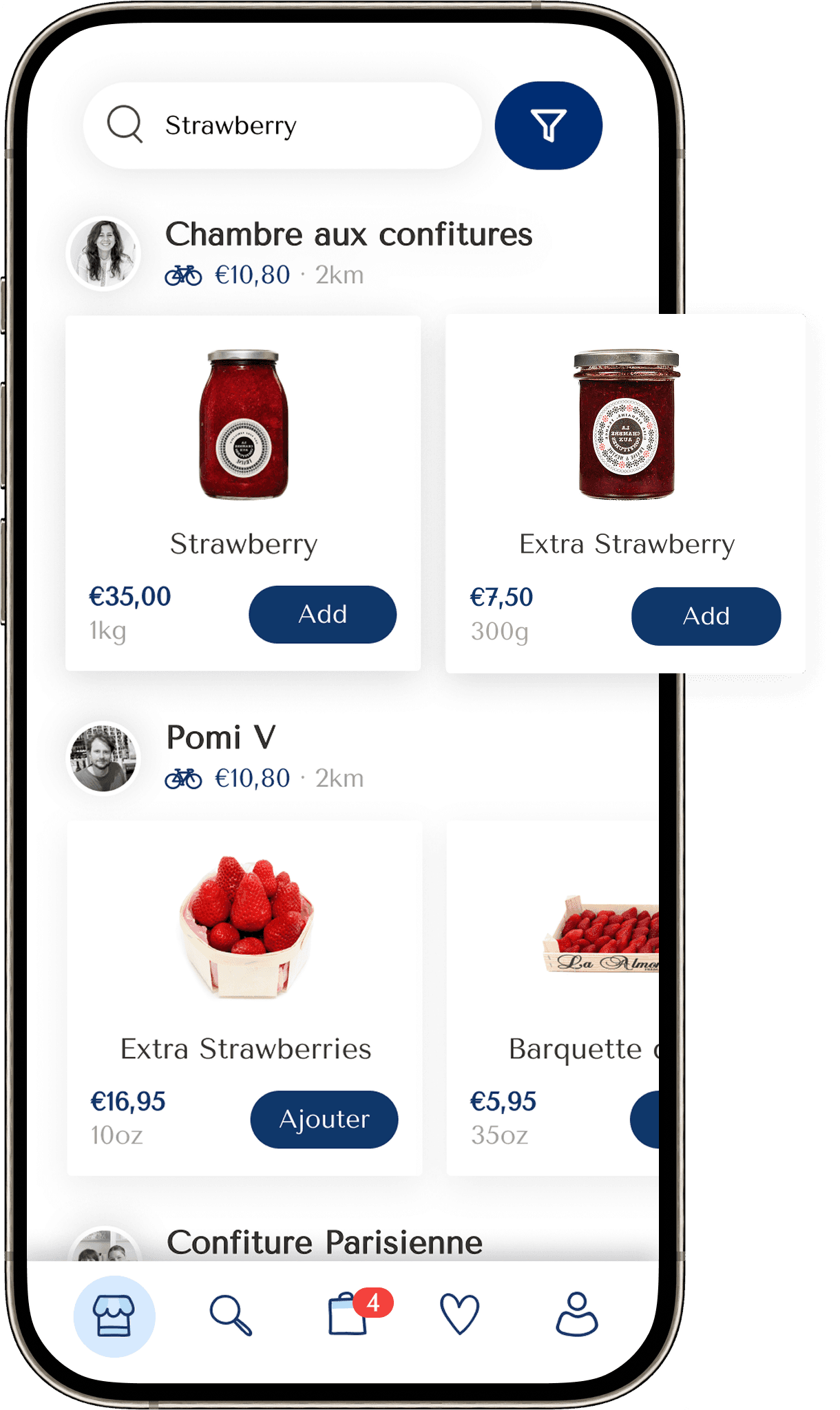
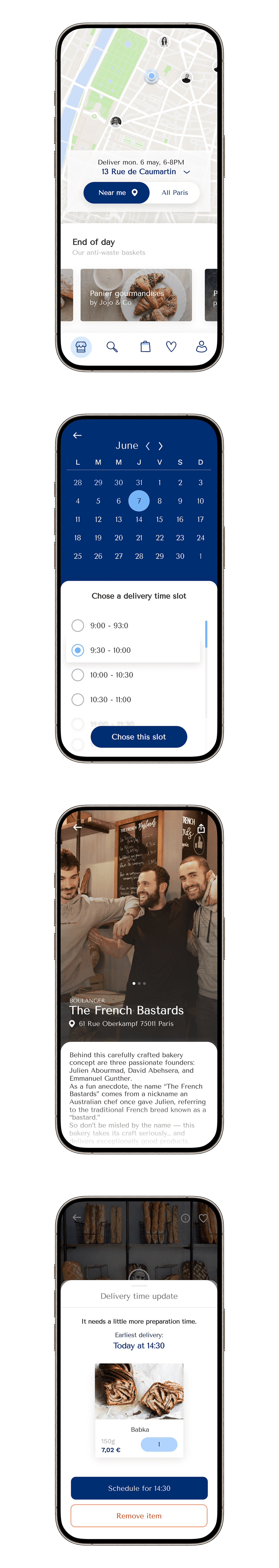
Nous avons testé deux approches pour gérer les artisans fermés lorsque les utilisateurs choisissaient une livraison "au plus vite", afin de réduire la confusion dans le parcours de commande.
Option A — Restrictive : les artisans fermés sont cachés ou bloqués.
Option B — Informative : les artisans fermés restent visibles avec une information claire sur leur disponibilité.


En tant que première designer interne, j’ai introduit des ateliers collaboratifs, des méthodes de design thinking et des cycles d’amélioration centrés UX.
Résultat : le design est devenu un vrai levier produit au sein de l’équipe, et plus seulement une étape de livraison.

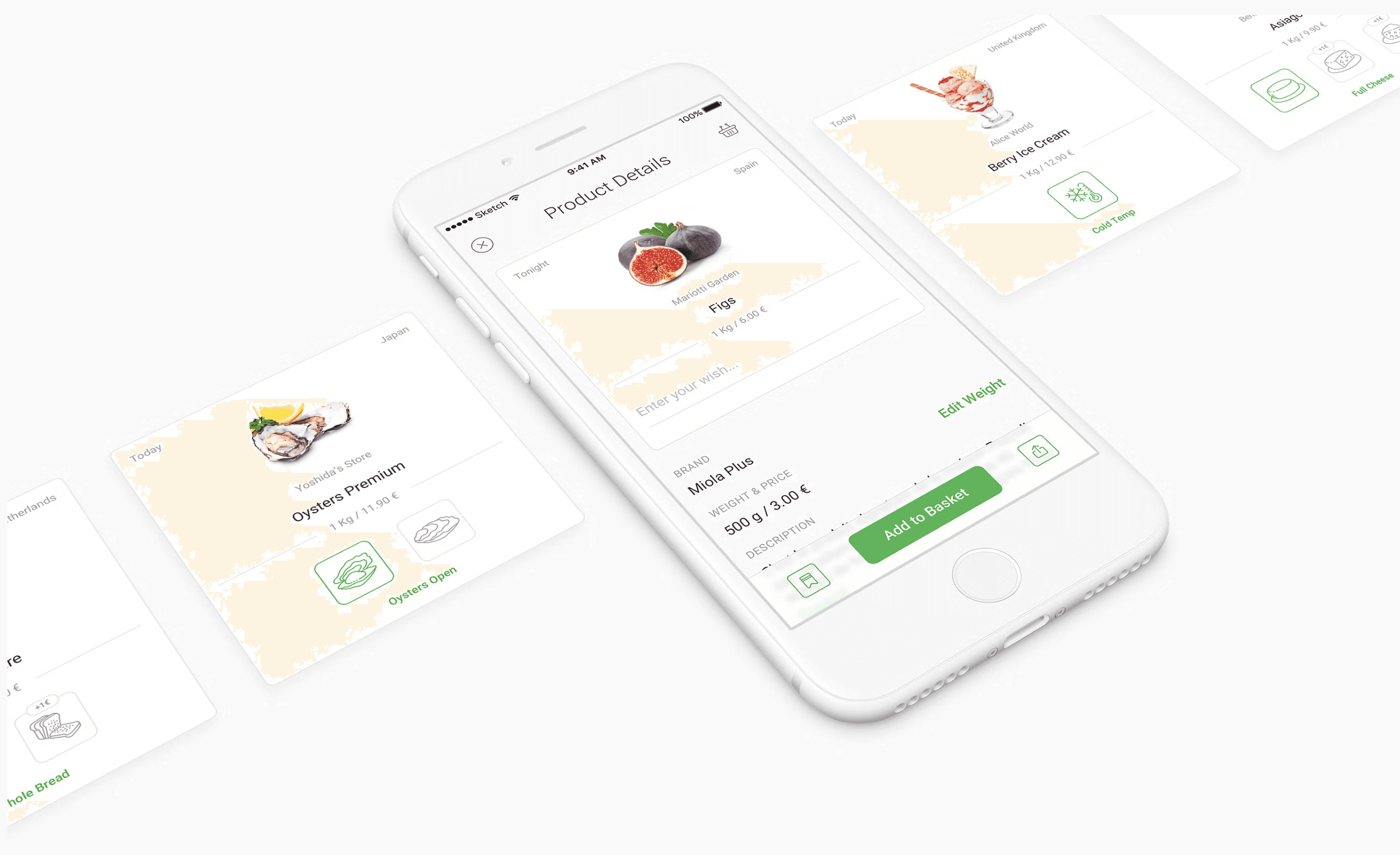
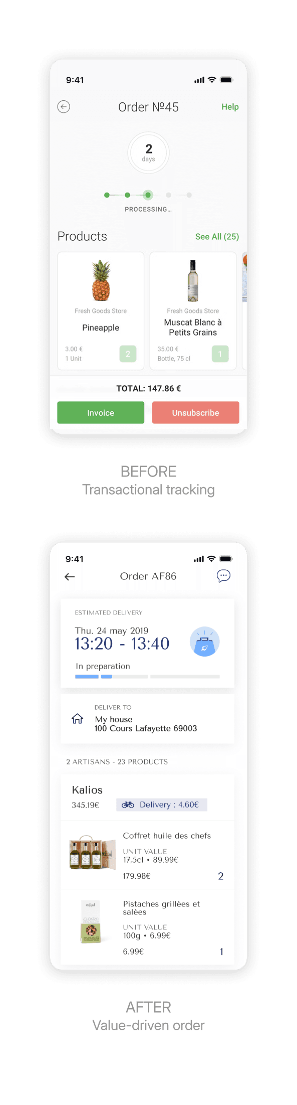
D’un catalogue transactionnel à une expérience de navigation
Identité artisan renforcée pour créer de la confiance
Hiérarchie claire pour faciliter les décisions
Contenus contextuels pour augmenter la valeur perçue


Ce projet a mis en lumière trois sujets importants :
Des releases itératives alignées business sont plus efficaces que des refontes massives
Prioriser et traiter les besoins design par lots ciblés permet d’améliorer le produit de manière continue et efficace.
La collaboration va au-delà de l’équipe produit
Les progrès significatifs viennent lorsque toutes les parties prenantes sont impliquées : designers, développeurs, métiers, utilisateurs mais aussi, et tout autant, les équipes liées aux produits physiques.
La clarté avant la perfection
Chercher la perfection UI trop tôt peut être contre-productif. La priorité doit être une interface claire et utile. Les raffinements viennent ensuite.
Ce projet reste l’un de mes préférés, autant pour son impact produit que pour l’évolution de l’équipe. Nous sommes passés d’une vision du design comme simple habillage à un véritable levier produit, et cette transformation a été particulièrement enrichissante.
Merci pour votre lecture.
N’hésitez pas à consulter mes autres projets !