Track
Improving a fleet tracking system adopted by over 1,000 clients*
UX
UI
BtoB


Timeline
Jan. 2024
— Early 2026
Scope
North America, South America,
Europe and Oceania
Platform
iOS & Android App, Web
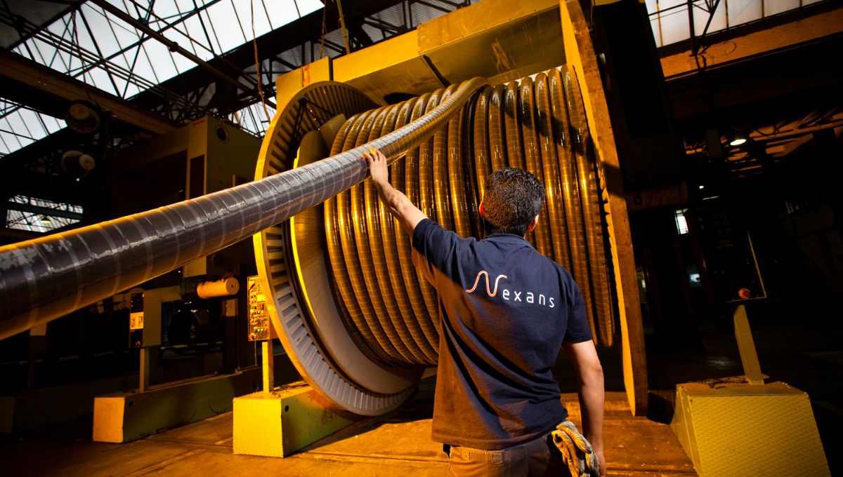
Track is a cable reel fleet management application designed for industrial clients to track, secure and manage their cable reels.
Launched in 2020 by the R&D team, the platform covers real-time anti-theft tracking, return management and order visibility, everything needed to keep track of equipment deployed across markets worldwide.
Industrial SaaS
Usability
International rollout
One of the most complex B2B products I worked on.
I worked closely with PMs and engineers to translate what users were actually experiencing into decisions the team could genuinely act on.
• simplifying complex workflows
• improving product consistency
• supporting product clarity and structure


A review of the existing product revealed several experience gaps affecting usability, consistency and accessibility.
The product surfaces many features and pages, but most are not aligned with real user needs — leading to low engagement and underused functionality.
Before any design, we deep dive into existing behavioral and data of our users to understand them better. We also conducted a series of customer interviews.
What is
the job that our customers hire our product for?
To understand how Track was used across markets, we conducted a mixed-method research combining a user survey and remote interviews with operational and business stakeholders.
This research helped identify key pain points around reliability, information hierarchy and product adoption.
Participants included operational, logistics and business stakeholders involved in cable reel tracking and asset management across different markets.


Real-time reel location
Reliability
Accurate and up-to-date tracking
Simplicity
Clear information hierarchy
Security
Alerts for abnormal reel movements
Circularity
Better visibility on reel returns and recycling
Business
Strengthen the value proposition of core offerings
Operational efficiency
Tailor services to individual user needs
Users
Increase content relevancy
Add a delightful, consistent consumer experience
Update key offers
Prioritized clarity over feature accumulation
Reduced cognitive load on critical operations
Operational visibility

+72%
Improved network monitoring


+50%
Reduced investigation time
Collaboration
To ensure maximum value delivery with minimal waste, we adopted a Lean Design approach throughout the project. By prioritizing user feedback loops, lightweight documentation, and rapid prototyping, we were able to align closely with real user needs and iterate quickly.
This allowed us to test assumptions early, focus on what truly mattered, and deliver meaningful outcomes without overinvesting in unnecessary features.
Define
User research and ideation
Design
Validate
Testing with users
We mapped each archetype to their user journey on the app, with their respective success metrics.
On the left, we have an example of the previously used user flow for all app. On the right, we have the newly improved user flow for each routine.


From feature overload
to task-focused experience
Consistent interface
for complex workflows
Clear navigation
to guide key user actions
Better data visibility
for confident decisions


Clearer product structure
This project reinforced three key lessons:
Focus on a specific market rather than trying to serve everyone
Trying to design for multiple international markets proved counterproductive. Aligning the product with the needs of a clearly defined professional user group brought much more clarity and relevance to the service.
What you sell matters as much as how you present it
The product worked well, but its value was not clearly communicated. As a result, many clients were unaware of what Track could actually do for them.
Design also means choosing what not to show
Designing for users does not mean exposing every option. Prioritizing the most relevant information and limiting visible choices helps create a clearer and more usable experience.
Track was a demanding and complex project that pushed me to navigate international product challenges and work on one of the most feature-rich platforms of my career. It strenghtened both my product thinking and my ability to simplify complex systems.
Thank you for reading. Don’t hesitate to take a look at my other works!