Nelio
Turning a standard food app into a premium curated experience.
UX
UI
BtoC

Timeline
Sept. 2018
— July 2019
Scope
France
Platform
iOS & Android App, Web
Nelio is a curated food delivery marketplace founded in Lyon in 2016, offering high-quality meals from handpicked local artisans, delivered by cargo bike in Lyon and Paris.
After an initial external launch, the product required a stronger in-house design direction to support retention and brand differentiation.
Marketplace
Consistency
Product quality
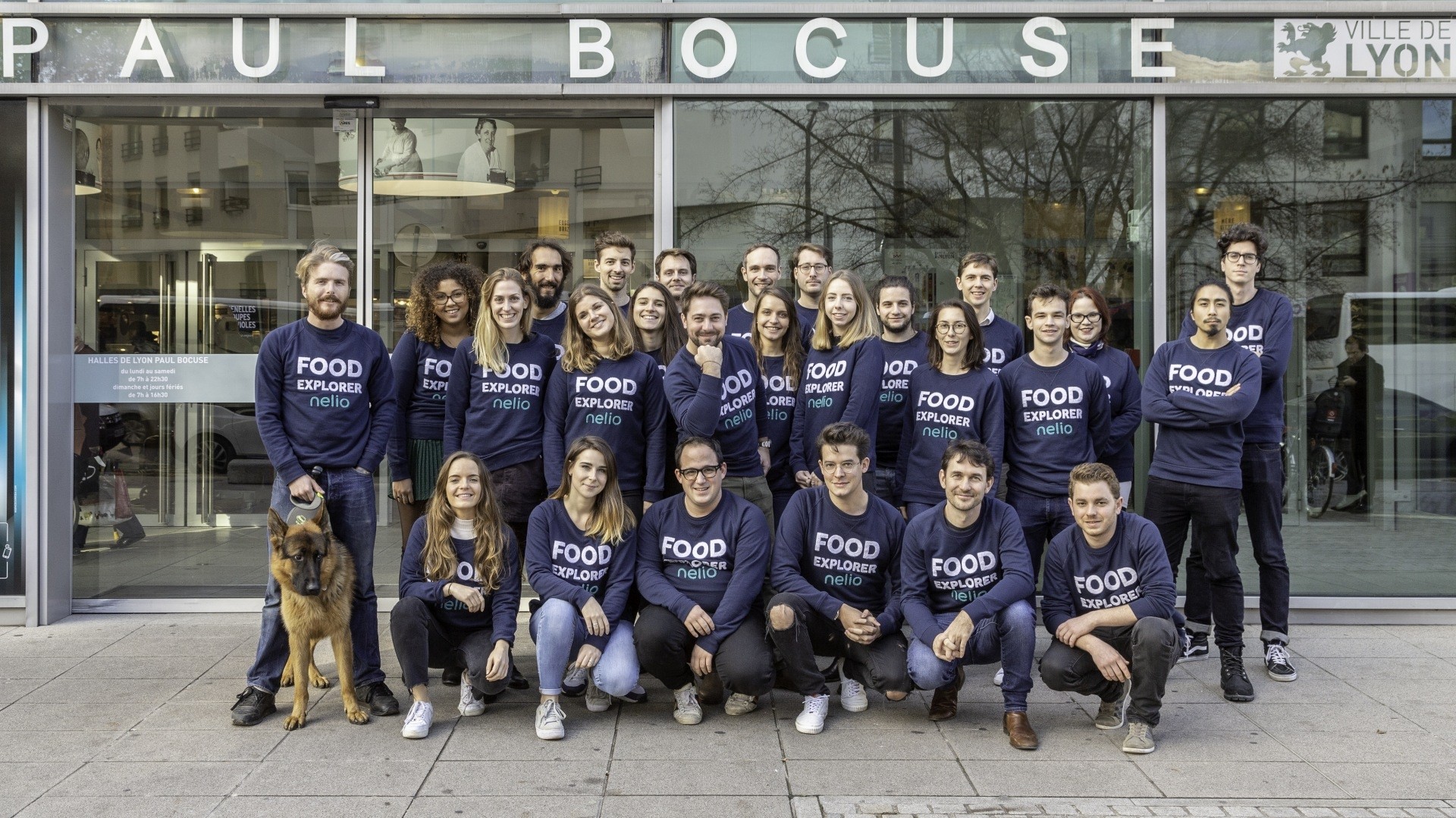
I led product design across mobile and web, collaborating directly with the CEO, CTO, product owners, marketing, and developers. I introduced structured UX processes and aligned design decisions with measurable retention goals.


Despite high-quality partners and products, the application struggled to attract and retain the right customer segment.
The experience did not fully reflect the platform’s premium positioning.
Weak premium differentiation
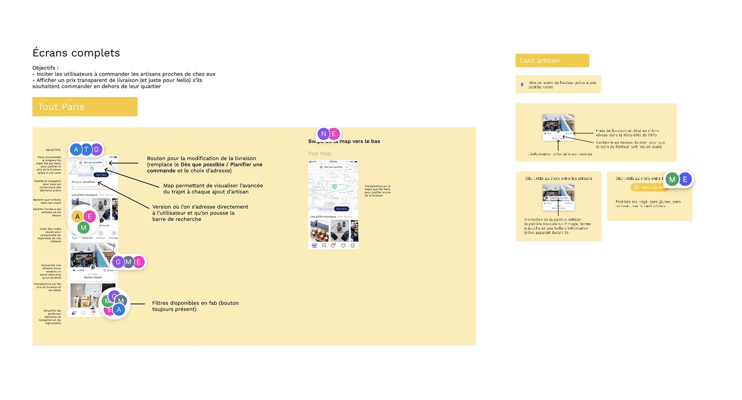
How might we create a premium, curated delivery experience
that increases retention and basket value?
Business
Increase customer retention and boost average basket size
Reinforce brand identity
Maximize key commercial moments
Users
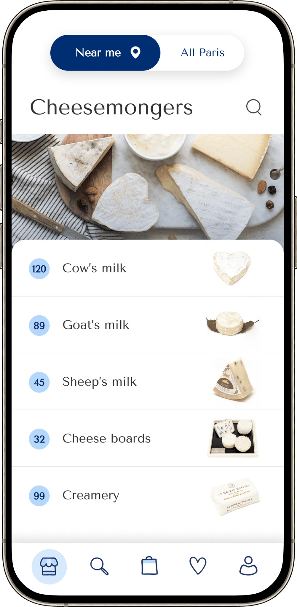
Find curated artisans without having to browse endlessly
Access clear product context, availability, and recommendations
Reduce cognitive load and make exploration feel effortless
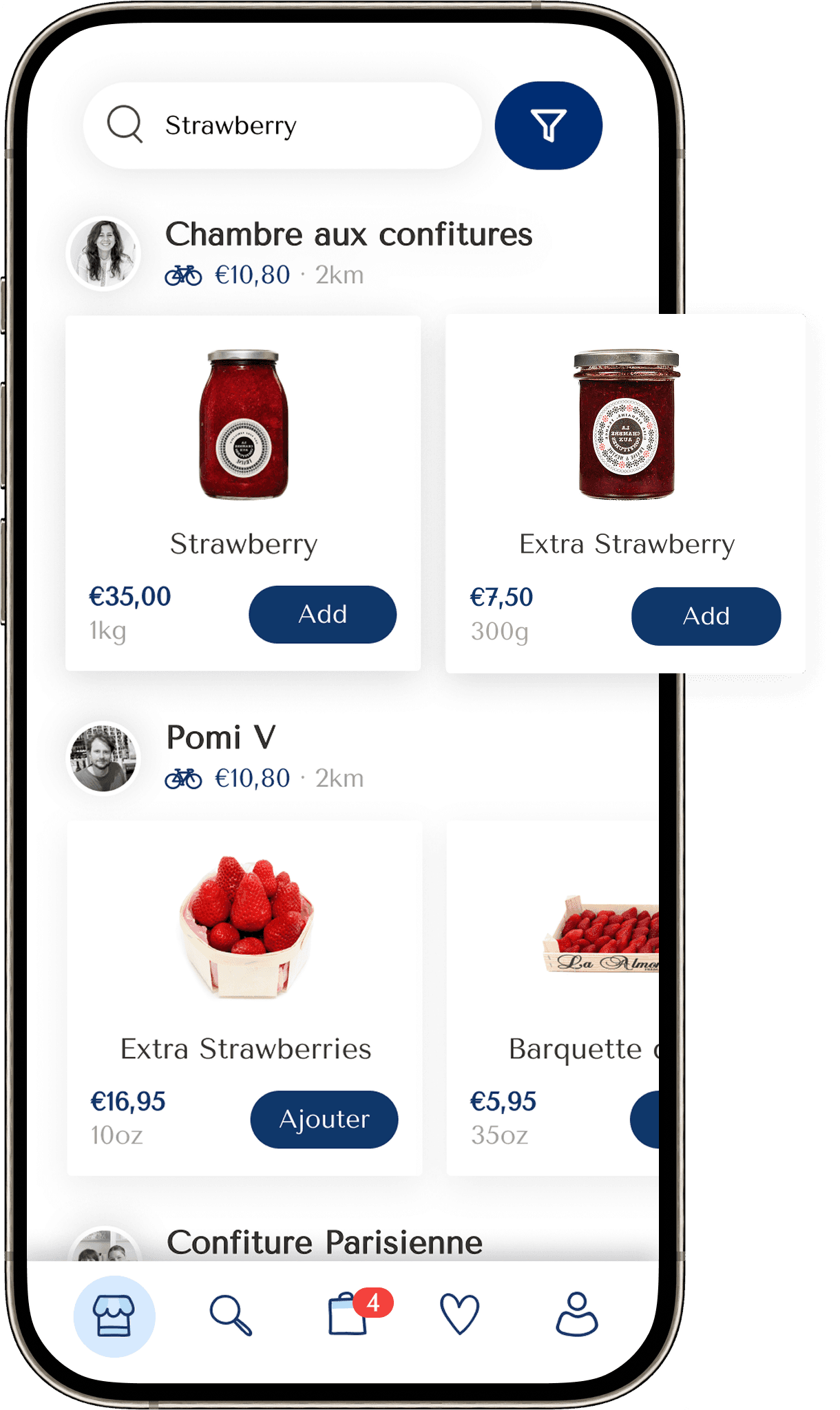
Simplified the purchase flow
Prioritized mobile usability
Improved onboarding process
+25%
Increase in user retention
+18%
repeat purchase rate
+22%
orders per active user
+24%
30-day retention rate
+84%
Increase in time spent on website
To understand real needs beyond assumptions, we ran user interviews with frequent customers and a guerrilla test in the streets of Lyon. This mix of in-depth and spontaneous feedback helped us spot patterns, refine hypotheses, and reveal why someone would (or wouldn’t) choose our app over others.
Why would users choose to buy from our platform
instead of others?


A/B testing
Key design decisions were validated through A/B testing, giving the team objective data to back creative choices. This approach not only secured stakeholder buy-in but also boosted confidence in the final direction.
We tested two ways of handling closed artisans when users selected a “deliver as soon as possible” option, aiming to reduce confusion and friction during the ordering flow.
Option A — Restrictive: closed artisans are hidden or blocked.
Option B — Informative: closed artisans remain visible with clear availability messaging.


As the first in-house designer, I introduced collaborative workshops, design thinking methods, and UX-centered improvement cycles.
The result: design became part of the team’s DNA, not just a deliverable.

From transactional catalogue to curated browsing
Stronger artisan identity to build trust and recall
Clear hierarchy
to support confident decisions
Contextual content to increase perceived value


This project reinforced three key lessons:
Iterative, business-aligned releases outperform large redesign bets.
Prioritizing and addressing design needs in manageable, focused batches is essential to drive efficient and continuous improvement.
Collaboration goes beyond the core team
Meaningful progress only happens when everyone is involved, not just designers and developers, but also stakeholders, end-users, and teams working on related physical products.
Clarity before perfection
Aiming for pixel-perfect UI components from the start can be counterproductive. Making the interface clear and usable should come first. Refinement can follow once the user need is met.